
Thanks to Ian Robertson of The Forum and Simon Waldron of injixo for their valued contributions to this post.
Reporting & analysis matter
Reporting is seen by some planners as an administrative task, completely lacking in kudos. That rather misses the point. The purpose of reporting and analysis is to continuously improve planning outcomes so that the organization’s business objectives are achieved. Reporting demonstrates that the planning function is learning from its mistakes. And reports are also benchmarks to celebrate planning team wins.
In this post, we assume that the reader is already adept with the mathematics of contact center reporting. We will explore eight strategic mistakes and advise on how to avoid them.
Mistake 1: Reporting on the wrong KPIs
Not all the data you need for reporting will be easily accessible. It is tempting to report on metrics for which the data is readily available, rather than those that matter. Data may exist in silos, but it’s the job of the planner to create reports which consolidate data from disparate sources into a comprehensive, meaningful, and actionable report. It helps if the systems containing the original data enable data to be extracted. Good WFM systems, for example, will include an API (application programming interface) that makes it easy to import any data you need into your chosen reporting tool, either a spreadsheet application or a business intelligence tool.
WFM key performance indicators (KPIs) should reflect the company’s business strategy and goals. In many contact centers, the same generic KPIs are used without challenge. Let’s take a look at some popular KPIs and deconstruct them.
Forecast accuracy
Nobody would dispute that accurate forecasts are the cornerstone of a good planning process. 95% accuracy is a common goal but is often selected without any rational basis. The best forecast is not necessarily the most accurate one, it’s the one that leads to the right outcomes. Even a 100% accurate forecast is worthless if ignored. A forecast that is only 80% accurate but elicits the right decision is a success. To quote Ian Robertson of The Forum “Forecast accuracy is not a measure of success, it is a way of understanding the level of flexibility you need to build into your plan”.
We build forecasts so we can build schedules that consistently match demand with supply. To realize the benefits of that, changes to the workforce will be needed and that requires action by the operation, not the planning team. Simon Waldron of injixo suggests “Operations will need to have answers to these questions”:
- If you are understaffed, will you hire?
- If you are over-staffed, will you stop replacing agents who leave?
- If you need more shift flexibility, will you need an HR intervention?
Shrinkage
Shrinkage is the percentage of paid time that agents are unavailable to handle contacts. This includes unproductive at-work activities such as breaks, meetings, training sessions, and 1:1s, plus out-of-office time for vacation, sickness, lateness, and general unexplained absences.
Is shrinkage necessarily a bad thing? At first glance, it appears that by reducing shrinkage, you automatically increase productive hours, which helps you achieve your goals more reliably. Just by reducing shrinkage, you will be able to handle more calls, to a better service level, without hiring any extra staff. What’s not to like?
Simon Waldron reminds us that reducing shrinkage comes with a price tag:
- How practical it is to reduce sickness rates? Only companies with a toxic, hire-and-fire culture try to discourage employees from taking sick leave when they need it. Metrics like absence levels, adherence, and conformance rates are best addressed in the 1:1 between the agent and the supervisor.
- More time off might reduce sickness levels, but this simply swaps one shrinkage factor for another.
- You can cancel 1:1s, coaching sessions, and training to manage peaks, but without training, quality suffers, turnover increases, and AHT (average handling time) is extended.
Shrinkage comes with other pitfalls, but obsessing about shrinkage, like obsessing about overtime, is a classic WFM mistake.
Service level
Service level (SL) is the one metric that practically every contact center uses to measure performance. It seems like heresy to question whether it should be reported. But Ian Robertson has found that customer satisfaction does not always correlate with SL. For many forum members, wait times for a wide range of call types have close to zero impact on satisfaction, provided the call is answered within 10 minutes and good service follows. SL is no guarantee of quality or good customer experience. SL goals can drive unwanted behavior, such as abrupt interaction with customers.
Many contact centers have an SL goal of 80% in 20 seconds, without understanding why. In fact, 80/20 is not based on science. It goes back to the dawn of call centers, when 3 rings on the US telephone network lasted 20 seconds and 80% was borrowed from the Pareto principle. Best practice is to choose an SL goal based on the business sector within which your contact center operates. 20 seconds is too long for emergency services. In many other cases, longer than 20 seconds is quite acceptable. The more aggressive the SL goal, the greater the staffing requirement and the higher the costs.
Mistake 2: Not balancing your KPIs
Targets always have unintended consequences. Ian Robertson tells us “On its own, any target is easy to achieve.” We can achieve our productivity goal by doing a poor job. We can achieve our quality goal by taking forever on each call, and we can cut costs by losing all of our customers or burning out our agents so that they all resign. You can even hit your SL goal by rerouting all calls outside the SL target to the back of the queue. All of these achieve the target but lose sight of the overall goal.
The balanced scorecard method can help. The WFM process needs to satisfy multiple stakeholders, so there should be KPIs for each category:
- Agents: Demotivated agents give poor customer service and are likely to leave. ENPS scores, turnover and sickness rates are good KPIs.
- Customers: They don’t like to wait, but customer satisfaction (CSAT) and net promoter score (NPS) are better indicators of satisfaction than SL.
- Finance: Costs need to be controlled, so cost per call and revenue matter.
- Compliance: It can be business-critical to comply with rules such as maximum waiting times in regulated industries, working time legislation, and penalty clauses in BPO (business process outsourcing) contracts.
Ian Robertson advises “The KPIs you choose should measure the extent to which you are achieving your business strategy”. Strategy includes:
- Vision: What are your organization’s goals? These should be communicated by your leadership and also appear in your annual financial report.
- Values: Again, these should be communicated by your leadership and probably appear in your corporate playbook and induction training. They describe how you should deliver the vision.
- Brand: Your brand values also affect the KPIs you need to focus on. Customers of low-cost brands expect to make compromises on service in return for a low price. Customers of premium brands expect efficient, high-quality service.
Mistake 3: Using the same KPIs year in, year out
The only constant is change. This sounds trite, but it definitely applies to WFM reporting and analysis. Businesses launch new products and cater to different customer demographics with different service expectations. New communication channels begin to thrive and others wane. Contact centers can’t ignore the impact on customer expectations and business imperatives of events like the financial crash of 2007 or the COVID-19 pandemic of 2020. Simon Waldron reminds us: “In early 2020, as the pandemic exploded, for many organizations it was completely unrealistic to continue focusing on service levels and forecast accuracy. The focus had to switch to answer rate and first call resolution.”
KPIs should not remain static. Good practice is to make a review of KPIs part of the annual planning cycle.
Mistake 4: Too many KPIs
Ian Robertson cites the renowned psychologist George Armitage Miller, who is famous for his paper The Magical Number Seven, Plus or Minus Two. This states that a typical human working memory can hold just 7 facts. Some contact centers claim to track dozens of KPIs. This not only contradicts Miller’s advice, but is also wasteful, demotivating, and counterproductive. Once you realize that you can’t achieve all your KPI goals, it is human nature to focus on the easy ones and neglect the difficult ones, regardless of which are most important.
KPIs are just that: key performance indicators. They are strategic measures that senior leadership needs to keep a handle on. There is also a role for operational performance metrics but the two must not be confused. It is unreasonable to expect leadership to pay attention to every single indicator when making strategic decisions. The axiom “more is less and less is more” applies to KPIs. Simon Waldron advises “4 KPIs per stakeholder group is good practice”.
Mistake 5: Reports that don’t pass the ‘so what’ test
Tl;dr is not the response you want from readers of your WFM reports. There is no point in providing reports that no one reads: ‘write only’ documents. Ian Roberston reflects “Do you read the terms and conditions on websites before clicking to agree? If you did read them, were they useful, or written by lawyers for lawyers?” Think about who reads your reports. Are the implications and required actions clear or do readers ask themselves “So what”? If the latter, it’s likely that your report was written by analysts for analysts.
Planners frequently reveal insights with the potential to deliver real value for the organization. However, this potential can only be realized if the insights are read and acted upon. “You don’t get a second chance to make a first impression” is an axiom that applies to WFM reports. So ensure the document opens with an ‘executive summary’ that distills the key messages, insights, and recommended actions.
Mistake 6: Not addressing your audience
Another axiom that applies to WFM reporting is “never underestimate their intelligence but never overestimate their knowledge”. It’s vital to mirror the language of your intended audience.
Reading age
Ian Robertson reveals “The Forum’s knowledge management networking group concluded that WFM reports should assume a reading age of nine years old.” Good practice is never to use 10 words where one will suffice. Don’t use long or unfamiliar words when a short and common word will work just as well. If you Google “reading age calculator” you will find many sites that estimate the reading age of text that you paste, and suggest improvements. You won’t always be able to reduce the reading age of a WFM report to 9, but it is usually easy to remove a few years.
Stories
When we want people to buy into an idea or listen to what we say, stories can be really powerful. But a common mistake is to tell the story from the perspective of the writer, not the reader. It’s a sad fact that in many organizations, leadership and operations management are not excited about the goals and challenges of the planning team. They care a great deal about the outcomes that the planning team makes possible.
Ian Robertson advises “The one story that we can be sure our audience will be interested in is theirs, so why not make the story about them?” Paint a vision of their success so that they are motivated to act.
Think about what motivates your audience. For some people, it is growth and achievement, for others, risk reduction and others smoother administration. You can expect the contact center manager to be concerned about staff turnover, whereas the finance director will be focused on cost reduction.
Mistake 7: Careless use of charts
Chart types and formats
WFM systems, spreadsheet apps, and business intelligence tools offer a huge library of chart types. It’s very easy to be seduced into selecting complicated charts, using myriad colors, 3D effects, shadows, etc. The truth is that elaborate charts rarely help to convey the message clearly and succinctly. Showing off with charts is rarely a smart move.
The following 3 charts all present the same information: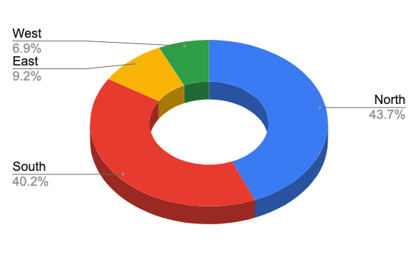
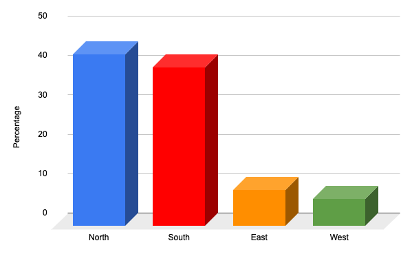
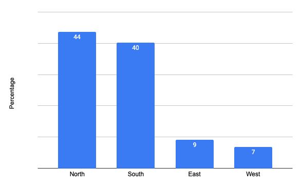
Let’s take a look at them:
- The first chart shows fractional percentages, which is more precise than required. Always use the appropriate level of precision.
- The first two charts use 3D and this reduces clarity rather than increases it. In general, 3D should be avoided.
- The first chart is a donut chart, which is a derivative of the pie chart. Pie charts are generally harder for the human eye to interpret than bar charts because of the difficulty in detecting angular differences. This applies all the more with a donut chart since the angle in the center is unclear.
- Color should be used sparingly. The first and second charts use traffic light colors but there is nothing inherently good, bad, or indifferent about any of the values on show. A single color is easier to read and less distracting.
- The third chart conveys the information clearly and concisely, without distractions. In other words: Keep It Simple.
There are situations where a pie or donut chart is appropriate. If you want to highlight similarities, e.g. in our example, that north and south have equal value, a pie chart makes sense. If you want to reveal even small differences, a bar chart is preferable.
Chart scale
Choice of scale can turn the conclusions which the reader takes from the data on their head. Look at these two charts, which purport to measure forecast accuracy:
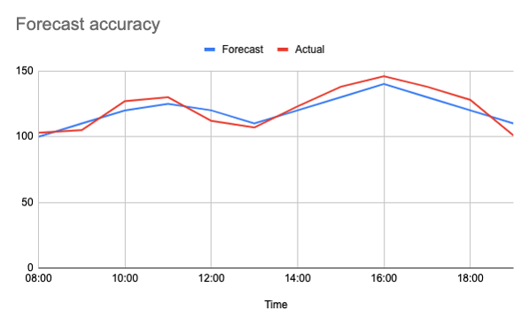
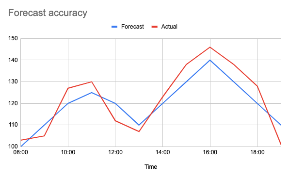
The first chart makes it look like the forecast was pretty accurate. There are some discrepancies, but the overall result seems positive. The second chart reveals large deviations. In fact, the same data is presented in both charts. The unscrupulous planner might choose the first chart to convince leadership that forecasting performance is good, which is far from the truth. The second could be used to reveal forecasting weakness and make the case for a new forecasting approach.
Mistake 8: No clear call to action
The purpose of WFM reporting and analysis is to continuously improve planning outcomes so that the company’s business objectives are achieved. More lessons are learned from failure than from success. When a lesson reveals the need for action, this must be highlighted.
Ian Robertson advises: “Every piece of insight we share, every report we produce, every presentation we deliver, should have a clear call to action. If there is no action to take, then all the effort spent in producing the report - and all the effort the stakeholders spent digesting it - is waste”.
Planning is all about eliminating waste and planners should apply the same rigor to reporting as they do to the rest of the WFM cycle.
What is an “action?” It may not imply an immediate tangible change. It may be about instigating research to find a solution. It can be to stop doing something that adds no value, creates risk or detracts from performance. Ian Robertson concludes: “It doesn’t have to be a change, sometimes the action can be to continue doing what you are doing. If people don’t know they are on the right path, they will wander off it. Sometimes, the action can be to celebrate success!”
Find out more
▶️ Want to learn more top tips about WFM reporting and analysis? Watch the video from our webinar Trade secrets every planner should know about WFM reporting & analysis.

Did you find the article interesting and would like to share it with your colleagues? Download the article as a PDF.